

I tend not to do very much in the way of photo editing. Most often I change photos to monochrome in some form, occasional selective colouring, occasionally a spot of defocusing to highlight the subject, and aside from the odd tweak that is generally it. But that is not to say that I don’t ever consider it.
What follows is nothing ground breaking, simply my own fumbling towards methods that others use on a regular basis.
I thought I’d share the development of a photo which ended up vastly different to what I had originally intended. Originally with this project I had simply intended to make a golden effigy stand out from its surrounding, but in the end I wanted to turn from a golden effigy into something a little more life like with an entirely different background.
So here is the starting point:

This is death, sat at the foot of Sophie Charlotte’s sarcophagus in the Berliner Dom. I took this photo back in 2012 whilst on a family holiday. It wasn’t possible to get a picture of the whole sarcophagus which you can imagine from what is visible in this photo was a quite ornately decorated thing.
But the photo is not that great, horizons off, no full context available – it just didn’t really work, though in all fairness I had expected this. It was the effigy I was after – I thought it was something I might be able to work with.
But what was I going to do with it? Being unadventurous to begin with all I did was a very basic selective colouring, removing all colour apart from the face (it was the first time I had tried this) – this was largely done by an action in the software rather than me doing anything. It was a very basic edit and was a bit rubbish to say the least. The gold wasn’t enough to stand out and the photo as a whole was still just a bit dull.
As stated above I was not very adventurous thinking it would be far too difficult to do anything that would be more effective and I had no editing skills whatsoever. As a result I put the idea out of my head for a while thinking I would try and learn a few things and come back to it another time.
It was about 3 months later I decided to brave it and have another go. But what should I do? My first thought was to make the figure of death more interesting, so I decided to have a play with the colouring. But his affected the whole of the effigy, it wasn’t separating the different elements such as the flesh and clothes.
By this point and I had experimented with selective colouring with the poppies in the fields by our house, so I had an understanding of layers and how they could be used, so I set about stripping down the image to its component parts. This first time round I simply focused on the idea above of flesh and other things.
As a quick note, the individual layers shown are from the latest working. They are also not shown to scale here, just at a more convenient sizing for display here.
So first off I had a layer that isolated the whole of the effigy:

From here I needed to get a layer that was simply the flesh, the next layer I created I was left with just the flesh:

Then followed a lot of experimenting with the colour curves to achieve what I was after. Whilst doing this however I realised that the background was still going to be quite poor, and since I had already isolated death I decided I might as well look for a different background for the image. There then followed a search on the internet for something I would be able to use as I had nothing suitable myself. I soon stumbled upon the idea of a lava pool, so I got an image to use, place this over the original background layer, merged all the layers together and this is what I ended up with:

Certainly at the time I was very pleased with this – it had taken a considerable amount of time to achieve but was very happy. I posted this on one of the sites I was a regular on and it seemed to go down quite well so I was again very happy.
However, I wasn’t happy that what I had done included an element that was not mine. Whilst not something I was massively bothered by I decided I would keep an eye out for something I could take a photo of and use as an alternative, the obvious choice being fire.
The following two years we had a number of barbecues so I did try getting something from the burning embers but was not really satisfied with what I had given myself to work with, and not having any open fires to get any photos of this was how things stayed until a little earlier this year.
In the summer my family and I went to the wedding of one of my wife’s best friends from her days at school. Being summer a lot of the wedding was outdoors but as the temperature dropped fire pits were lit to keep the warmth up for those sat outside. This gave me some opportunities to get what I wanted:

As it turned out I had lost the original working files I had created the first major edit with, so I started the process again, but decided this time there were a few things I wanted to do differently to try and improve on the affect I had achieved last time.
So I started with the same original image and began in the same way, isolating the whole effigy, then the flesh, and then going a few steps further.
This time I also isolated in order of layering from furthest back to the front, the book pages, the book cover, the pen, and the eyes:


I deliberately put the pages of the book on first so that I did not have to worry too much about getting the pages isolated perfectly – the cover would do the rest of the job as this was going to sit in from of the pages.
This again got me to the stage of fiddling with the colour curves for each layer. I decided to stick to a more bone-like colouring for the flesh and took it from there.
Once I was happy with the colours I then merged all the layers together for the final image.
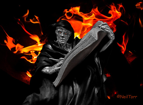
Though still not perfect I was happy in thinking this was an improvement on the original work I did.
I would love to know what you think of this post and the results of my efforts. Which version did you prefer? Is there anything you would do differently? Do you have any additional ideas?
Thank you for reading.

